Plotting Rides
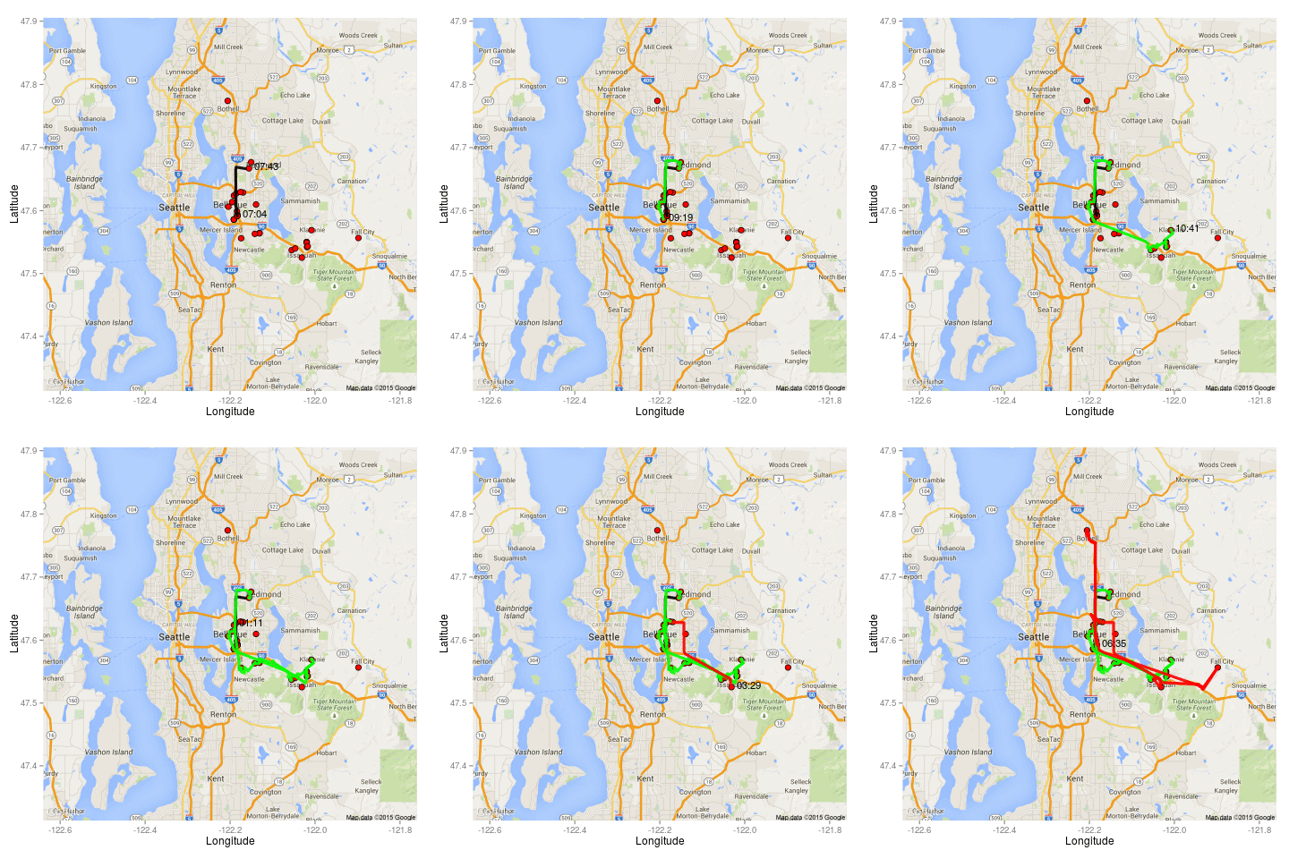
Recently, we’ve worked on cost per boarding metrics for individual passengers and we were interested in visualizing the physical distance that the riders traveled. Plotting the routes traveled are also helpful for understanding why some routes (“ugly rides”) are so costly for King County to provide.
In order to plot the routes, we first attach a cost to each rider. Then, we randomly sample from routes that have cost-probitive rides (“ugly rides”) and select an individual bus’ schedule for a given day. Using Google Maps API, each leg in a ride is sequentially plotted by color with green indicating cost-effective legs and red denoting cost-prohibitive legs. After plotting every leg (with information about the preceding legs layered over), a .gif is created that shows an individual bus’ schedule.
Besides, being fun to make, these .gifs visually represent the problem of cost-prohibitive rides. Namely, cost-prohibitive rides tend to traverse comparatively large spatial and time distances with pick up or dropoff locations that are disperesed away from the cluster of other riders.
