Posts
-
Final Presentation
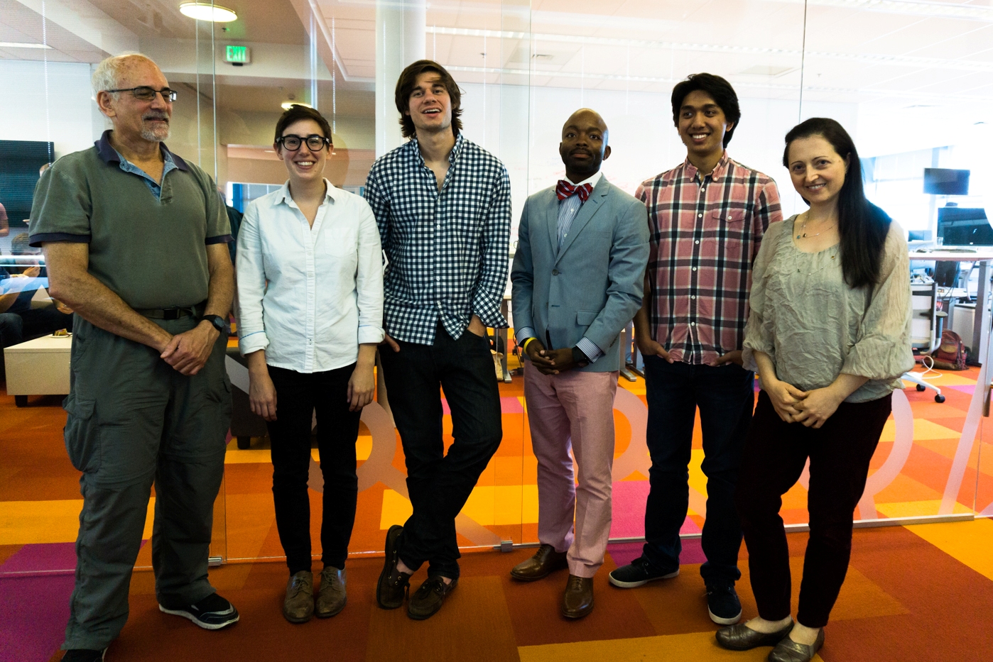
On Thursday, August 20th 2015, the Data Science for Social Good (DSSG) teams presented their final project solutions and analysis to the eScience community and guests. Each team showcased impressive contributions from 10 intensive weeks cleaning, managing and wrangling data into shape for evaluation.

The Paratransit team’s final presentation is here. We also want to acknowledge our teammates Emily and Valentina who were vital for the work we did this summer, but were unable to attend the closing ceremony.
For further reading on the DSSG program, the University of Washington and Xconomy wrote profiles of the DSSG program, incubator projects and fellows’ day-to-day activities.
-
Out-of-Service Buses
During our historical analysis for King County Metro (KCM), we looked into the possibility of predicting out-of-service buses each day. Buses become out-of-service generally after breaking down or if they are unable to arrive at their destinations. Predicting out-of-service buses is important from an operational perspective because KCM and their contractors can better manage their vehicle fleet by preparing adequate standby vehicles each day.
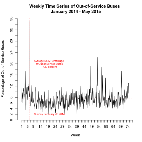
Our model uses the daily percentage of out-of-service buses relative to all buses operating that day (instead of raw counts of out-of-service buses). Using time series techniques, we analyzed almost 18 months (January 2014 to May 2015) of KCM transit data and concluded:
- On average, 7.47% of buses are out-of-service each day
- No deterministic trend over time
- Some weekly seasonal variation (more on that later)
- A snowstorm on February 9th 2014 coincided with the highest daily percentage of out-of service buses

-
A Deadhead Plot
Here’s an interesting plot:

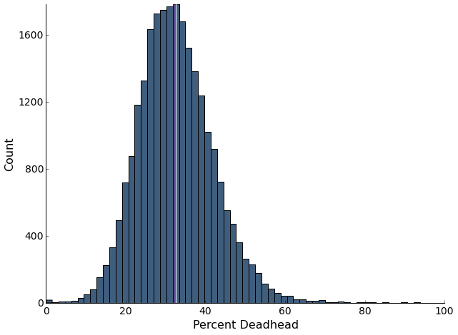
In traditional fixed route transit planning, deadheading usually refers to portions of the route that are not in service: say, going from base to the first stop. However, since paratransit exists in a slightly different paridigm where routes are flexible and the pickup and dropoff locations of riders are known, deadheading refers to any portion of the route without a rider. Given that any increase in time that buses have to be out increases system costs, and deadheading itself doesn’t actively service anyone, deadheading is a necesary evil that needs to be minimized.
Since our data has a row for each action (pickup, dropoff, getting gas, going to base etc.), ETA, and the number of passengers on the bus at the time of the action, I was able to sum the time that each deadheading row took and divide that by the total time for each run. This plot shows the number of buses that don’t have passengers for a certain percentage of their route in our cleaned 4 month dataset. It also demonstrates that this data is relatively normal around a mean/median of around 32%, with a number above 50%.
-
Expensive Ride Analysis
How do you measure the financial impact of a client on the Access bus system? One can imagine a ‘cost-per-boarding’ type of metric might be useful for assessing total client costs. Currently, King County Metro uses an intuitive but not very granular definition of cost-per-boarding: total Access expenditures divided by number of clients serviced in a year.
Instead, we came up with a new definition of cost-per-boarding:

That is, the cost-per-boarding of client j is the sum over all of the ‘legs’ during which the client is on board the bus of the total seconds the leg takes divided by the number of passengers during the leg. For example, suppose client 123 is on the bus for 2 legs (that is, ze gets on the bus, the bus stops to service another client, and then drops client 123 deboards), the first leg takes 900 seconds and there are 4 total passengers, and the second leg takes 400 seconds and there are 3 passengers. This cost per boarding is $4.86$. Note that the average Access service cost per second is $48.09/3600, i.e. $0.013558 per second.
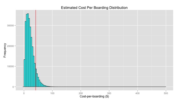
From the 4-month ridership data (Jan 1, 2015 - April 30, 2015) we received from King County Metro, we can see the distribution of cost per boardings:

From here, we’ve chosen to call the top 10% of these costs the ‘ugly rides’ (this is a term used by KCM… we didn’t coin it!). These ‘ugly rides’ account for 24.4% of all client boarding costs. Now KCM has a working definition for ugly ride.
There are still a few things that effect overall operational costs for a given bus, mainly, deadheading time. If two buses only have one client for an equal amount of time, but one bus has to travel to Snoqualmie and the other’s client is in Bellevue, the former bus will be more expensive. We have done additional analysis on the amount of deadheading time Access buses usually spend - the average bus spends about 30% of its time without passengers on board!
-
Project Update
We spent the last few weeks combining the individual components and functions designed to aid in disaster recovery into one complete bus rescheduling algorithm. Disaster recovery involves rescheduling individuals or entire buses that are at risk for falling behind schedule because of unforeseen conditions such as vehicle breakdown, traffic, etc. Combining, debugging and testing the algorithm has been the most difficult and most rewarding part of this summer. We’re hopeful to complete the web interface for dispatchers to use our algorithm soon and may demo our deliverable to King County Metro Access administrators before our program’s conclusion.
Additionally, we’re trying to create predictive analyses and visuals that take a closer look at the broader operations of Access service such as distance traveled per passenger, proportion of total trip time that involves deadheading (distances traveled without passengers on bus), and cost per boarding to name a few. The goal of these analyses is to understand how operation patterns such as bus routes, amount of clients serviced per bus influence costs.
-
Stream-of-Paratransit-consciousness
(My) Quick Link
Check out my Blogger.
I’m not a fan of walls, of all types - walls between people, nations, or personalities - and that is why my blog is mostly a stream-of-consciousness, very personal account of what is going on with our data science project. Buzzwords beware, because to me, they’re a huge obstacle to more people being open to the big data-fication of our many public and private data outlets. The insights, the struggles, and the pretty diagrams - feel free to check them out!
-
Updates from Emily
Quick Link
My blog can be found at this page.
As of July 24th, we are in week seven. Week eight starts July 28th, and so on and so forth.
Explaining my blog
If you take a look at my blog, you might start wondering, “Hey, what is this DREU thing? Isn’t this supposed to be done through the eScience’s DSSG summer program?” You’re correct, and although I am not officially a DSSG summer intern, I am a part of the paratransit team and the DSSG program has graciously allowed me to attend all their tutorials and presentations. Technically, I am here at UW doing computer science research under my mentor, Anat Caspi, through the DREU program. DREU (Distributed Research Experience for Undergraduates) is a selective program that pairs up undergraduate student applicants with a faculty mentor from a research institution. My mentor, Anat, is the director of the TCAT center here at UW and she is the project lead for the paratransit project that TCAT is doing in conjunction with eScience’s DSSG program. So, as her student, Anat decided to put me on the paratransit project as the main part of my research for the summer.
-
Plotting Rides
Recently, we’ve worked on cost per boarding metrics for individual passengers and we were interested in visualizing the physical distance that the riders traveled. Plotting the routes traveled are also helpful for understanding why some routes (“ugly rides”) are so costly for King County to provide.
In order to plot the routes, we first attach a cost to each rider. Then, we randomly sample from routes that have cost-probitive rides (“ugly rides”) and select an individual bus’ schedule for a given day. Using Google Maps API, each leg in a ride is sequentially plotted by color with green indicating cost-effective legs and red denoting cost-prohibitive legs. After plotting every leg (with information about the preceding legs layered over), a .gif is created that shows an individual bus’ schedule.
subscribe via RSS
